I’m a visual communications designer caring for communities through conscientious research, meaningful interactions, and well-made things.
I am a visual communications designer caring for communities through conscientious research, meaningful interactions, and well-made things.
︎ Contact
Post-Disaster Communication in East Palestine, Ohio
Team
Sam Colavecchio, Emily Moran, Audrey Reiley & Lizzie SokolichTools
InDesign, Figma, IllustratorTimeline
7 WeeksOverview
We researched the politics of trust and information sharing in the context of community recovery from environmental disasters and built an artifact to lessen the disconnect between the community and information holders.This project is a part of the coursework in the Carnegie Mellon School of Design.
Ecosystem
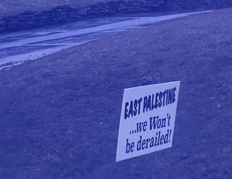
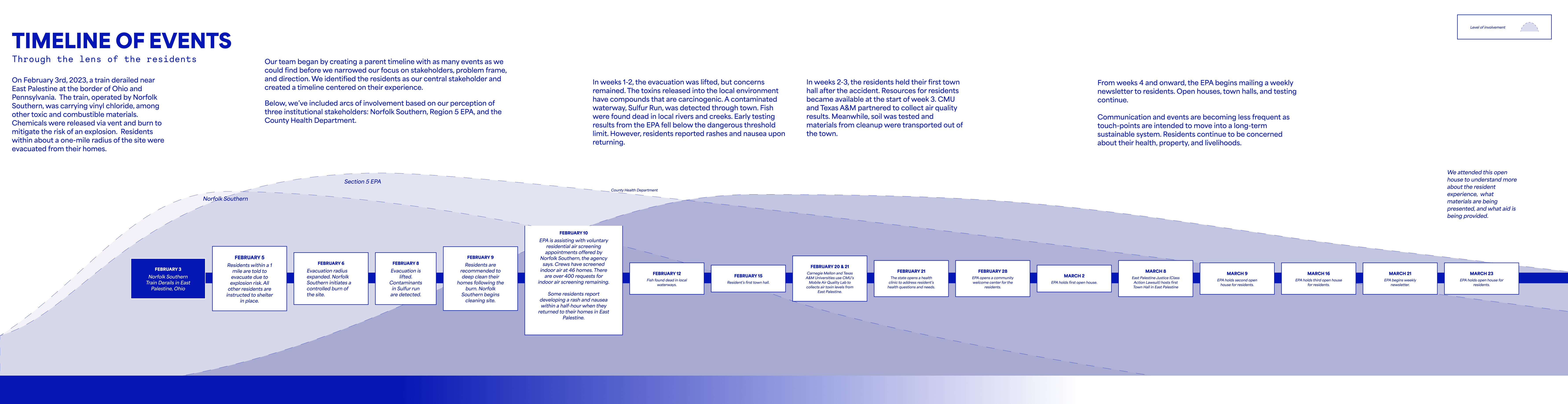
On February 3, 2023, a train derailed near East Palestine at the border of Ohio and Pennsylvania. The train, operated by Norfolk Southern, was carrying vinyl chloride, among other toxic and combustible materials. Chemicals were released via vent and burn to mitigate the risk of an explosion. Residents within about a one-mile radius of the site were evacuated from their homes.
East Palestine is roughly 50 miles from Pittsburgh. Our group decided to tackle this problem space to see if we could provide any support to affected residents and begin to untangle the complexities of post-disaster communication.
East Palestine is roughly 50 miles from Pittsburgh. Our group decided to tackle this problem space to see if we could provide any support to affected residents and begin to untangle the complexities of post-disaster communication.
Research
To gain a deeper understanding of the problem space and test our initial assumptions, we developed a research plan consisting of onsite research, observational research, secondary analysis, and expert interviews.
Reframing
Through our research, we discovered the core paradox central to the issue of the residents’ distrust of the information holders: there is an inherent distrust and skepticism of the provided data because the information presented by institutional information holders is inconsistent with the residents' experience.
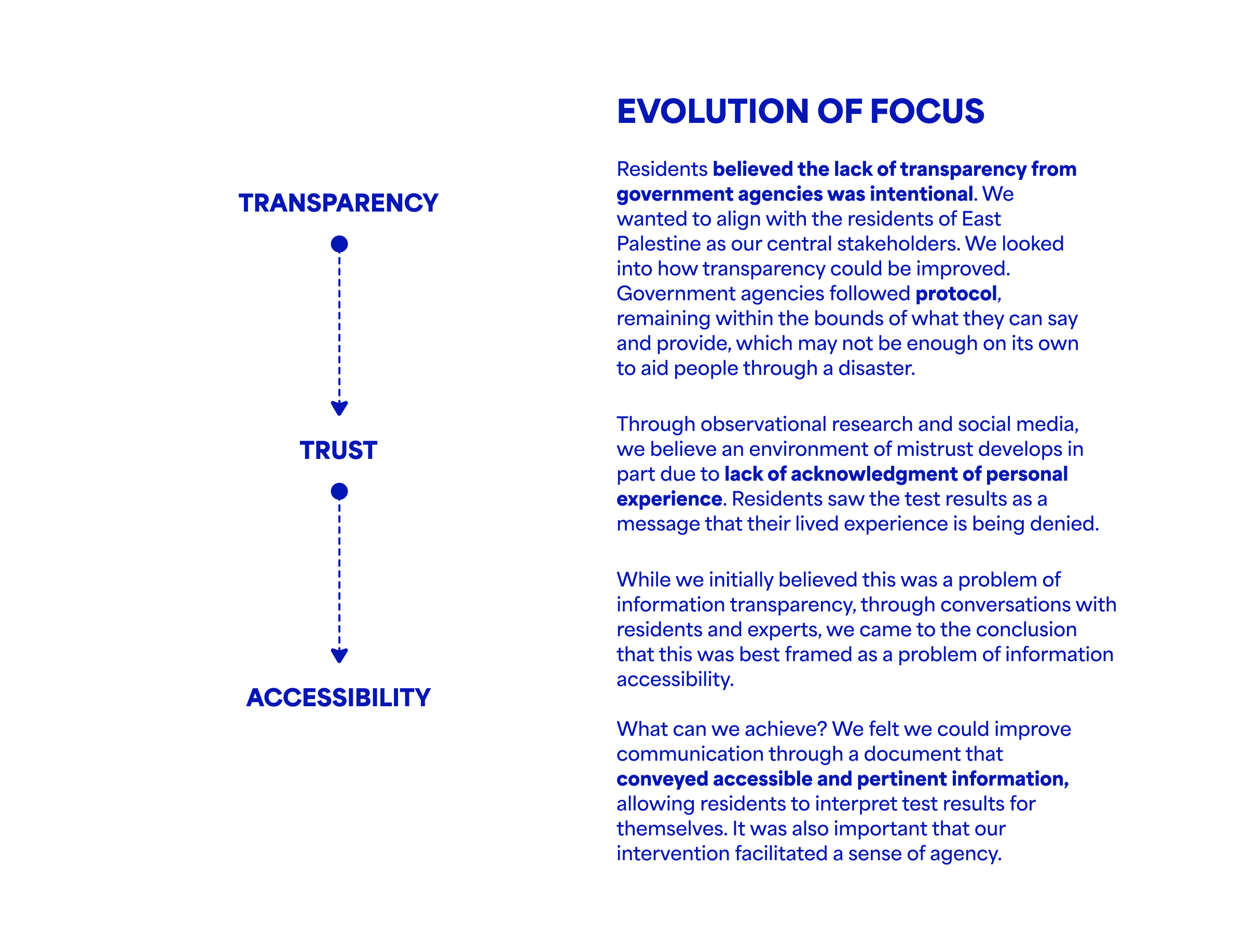
Residents believed the lack of transparency from government agencies was intentional. We wanted to align with the residents of East Palestine as our central stakeholders. Government agencies followed protocol, remaining within the bounds of what they can say and provide, which may not be enough on its own to aid people through a disaster. We looked into how transparency could be improved.
Through observational research and social media, we believe an environment of mistrust develops in part due to lack of acknowledgment of personal experience. Residents saw the test results as a message that their lived experience is being denied.
Concept & Prototype
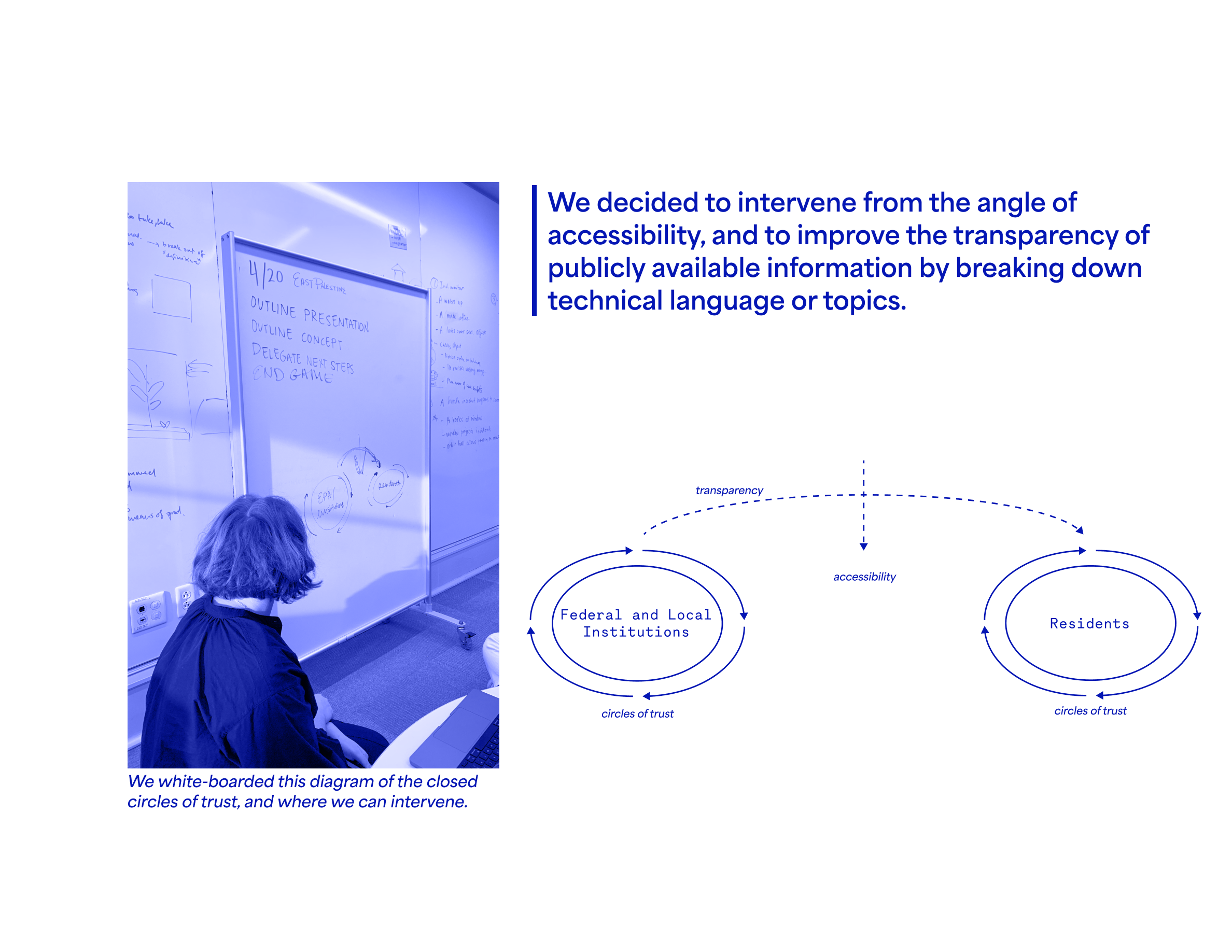
While we initially believed this was a problem of information transparency, through conversations with residents and experts, we came to the conclusion that this was best framed as a problem of information accessibility. As a result of our research and reframing, our team mocked up “In a Nutshell”– an open source, printable document publicly available for all impacted parties to use to help share and digest complex information. It offers space for users to share information in both Q&A and build how-to diagrams.

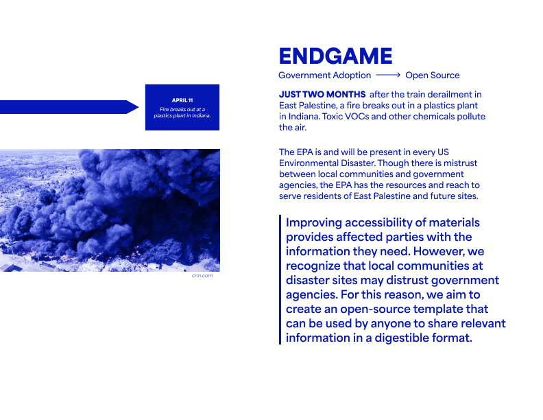
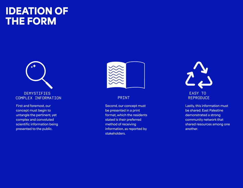
The document is publicly available on Dropbox, editable via PDF and formatted to be easily reproduced on any copy machine.
Continued Evaluative Research
In the Spring of 2024, I had another opportunity to continue to iterate on this initial concept and perform a series of two evaluative research sessions to explore new avenues. After reflecting on the project for a year, I wanted to explore how a web-based system could help deliver information in real time.
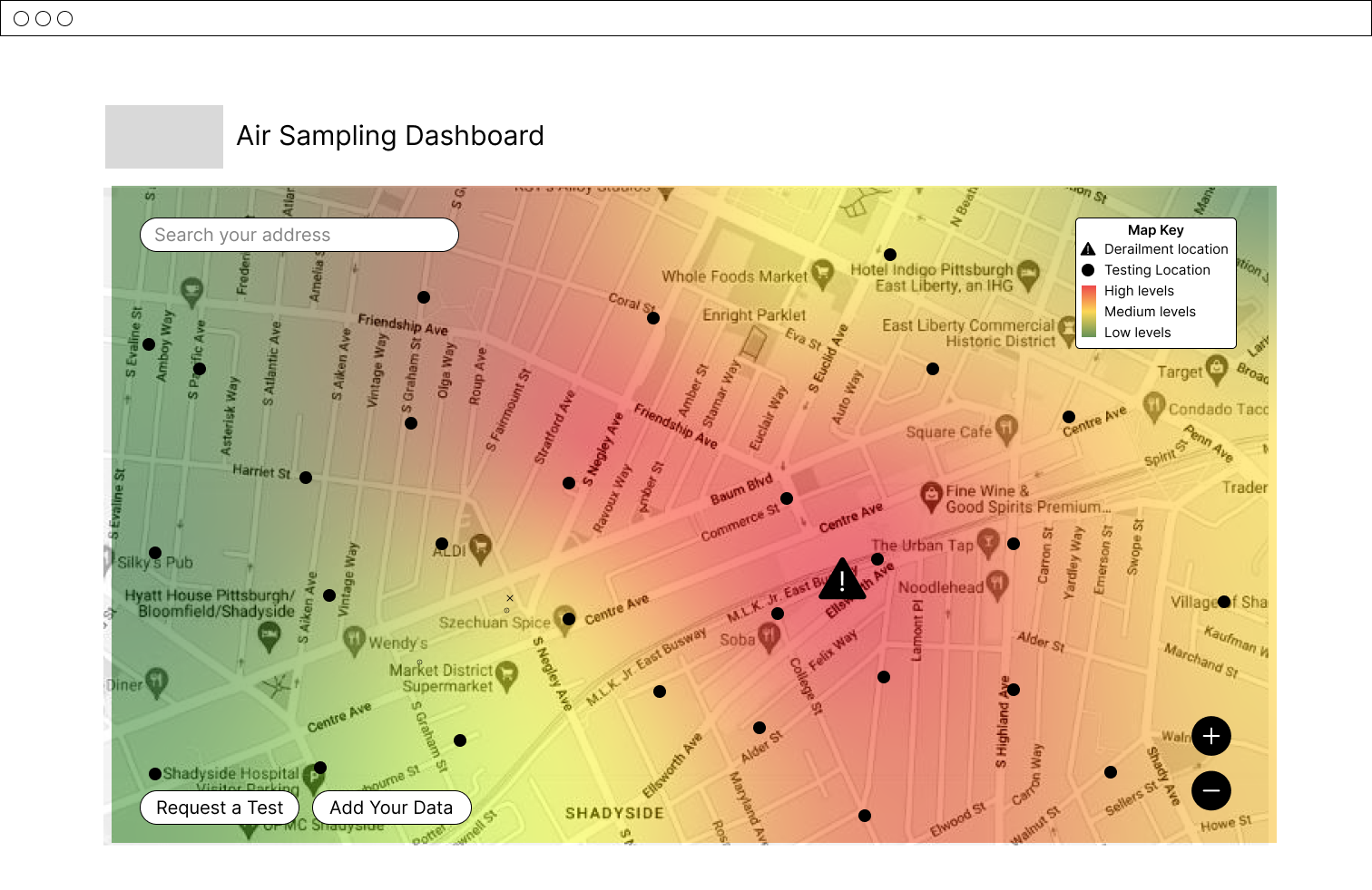
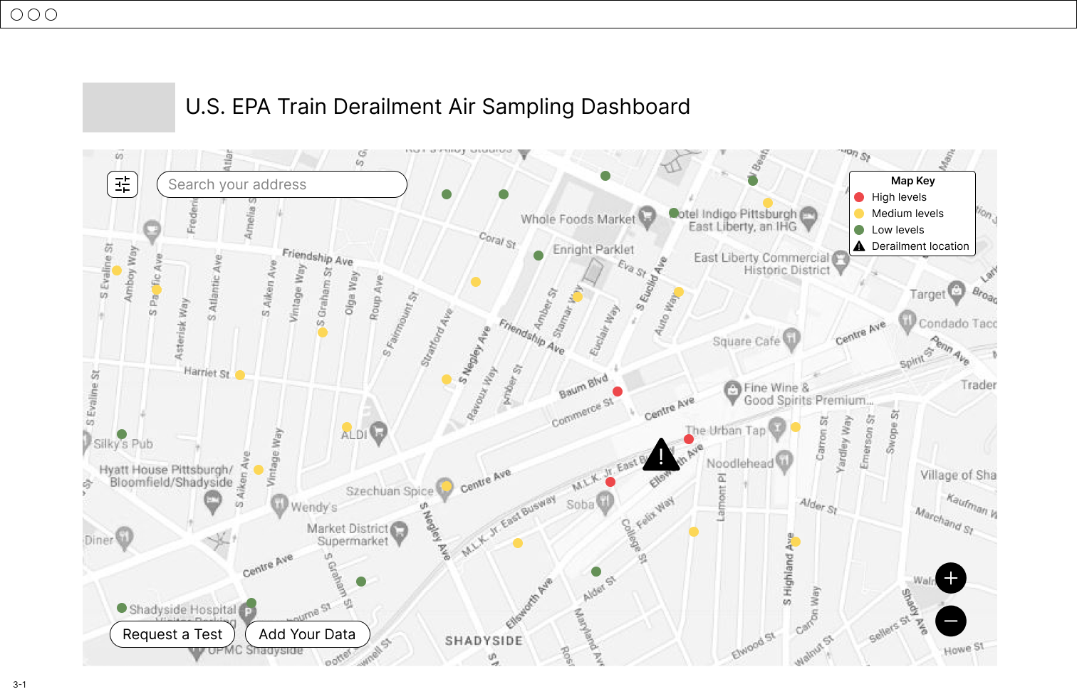
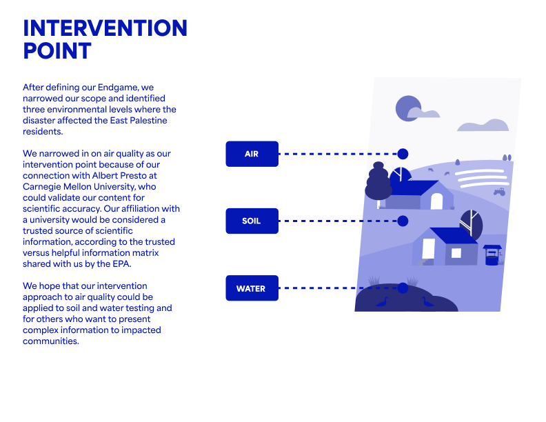
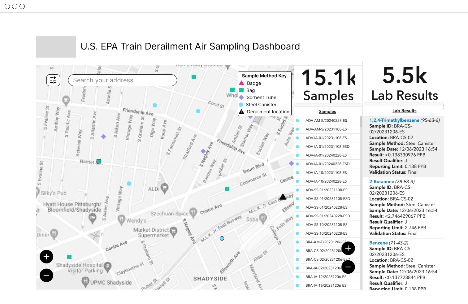
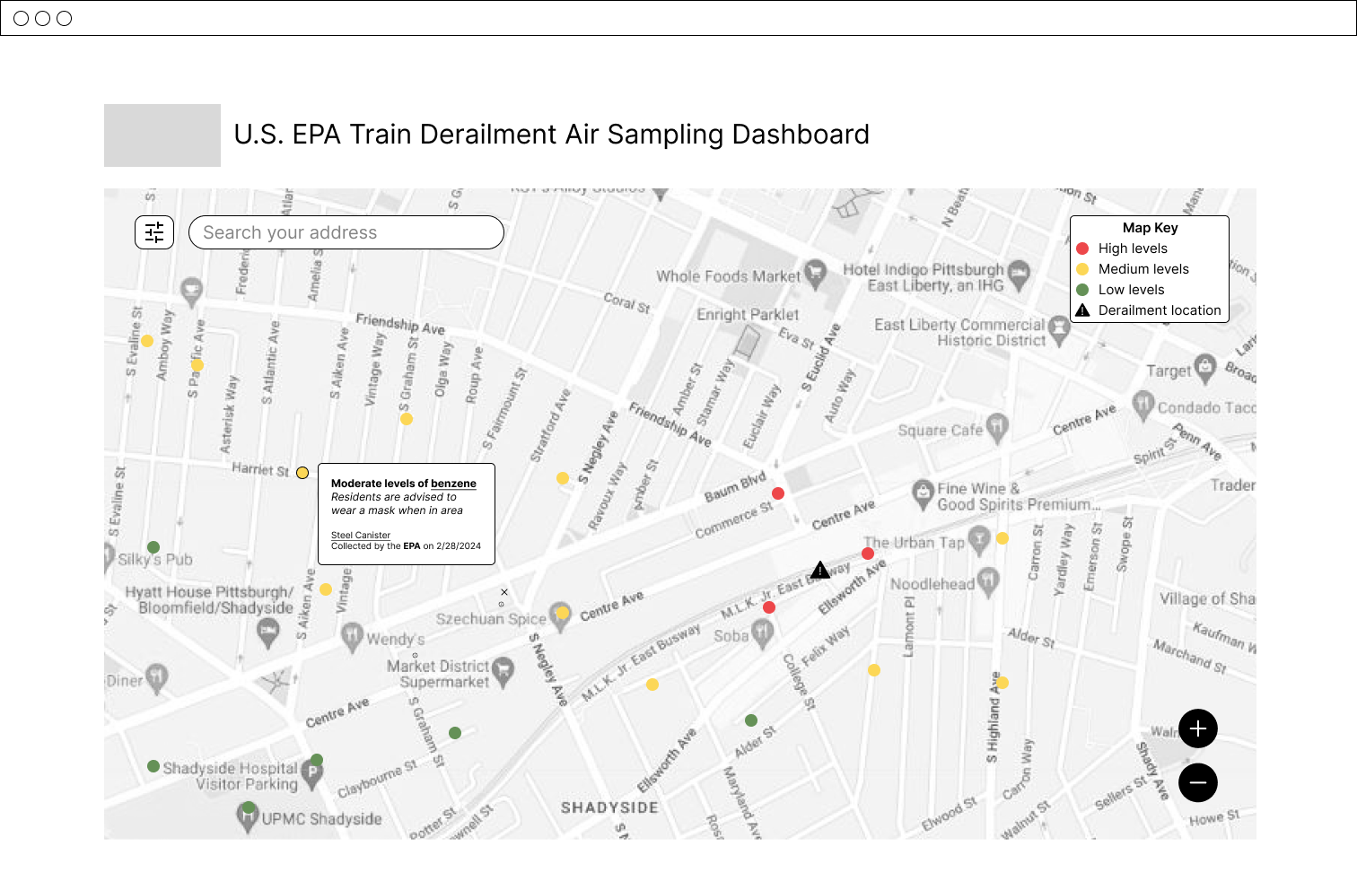
For this second phase of iteration, I wanted to learn how people understood and acted upon pertinent information about air quality test results. As a starting point, I used the EPA’s Air Sampling Dashboard used to communicate test results during the aftermath of the train derailment in East Palestine.
For the first stage of sessions, I prepared three mock dashboards that presented air quality test results that used varying levels of scientific expertise and visual languages to communicate dense material. The evaluative sessions were performed with a set of participants with varying degrees of scientific expertise and were not affiliated or directly impacted by the East Palestine train derailment. Using a speed dating methodology, I presented the particiants with a scenario involving a train derailment in Pittsburgh, PA.
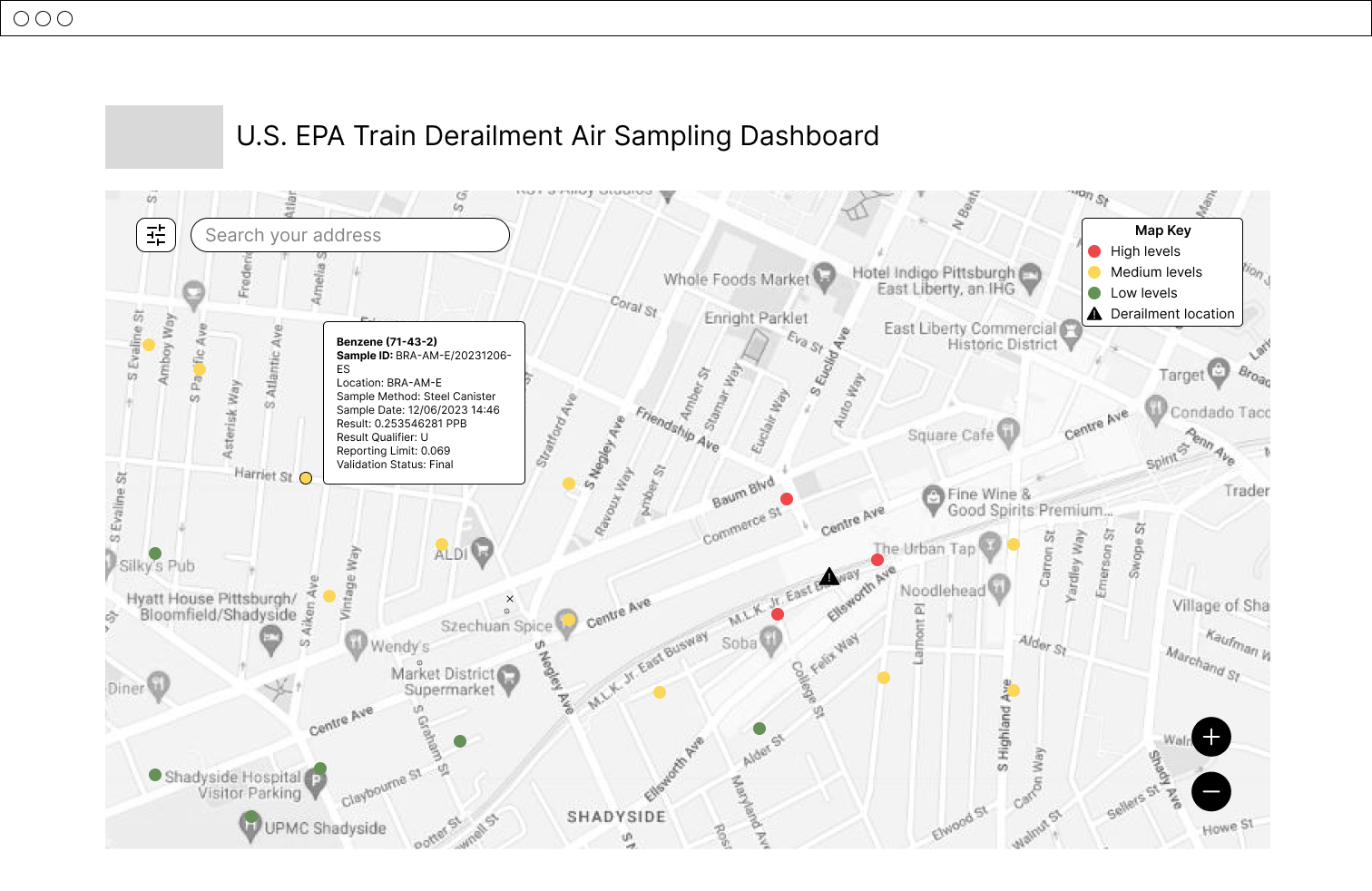
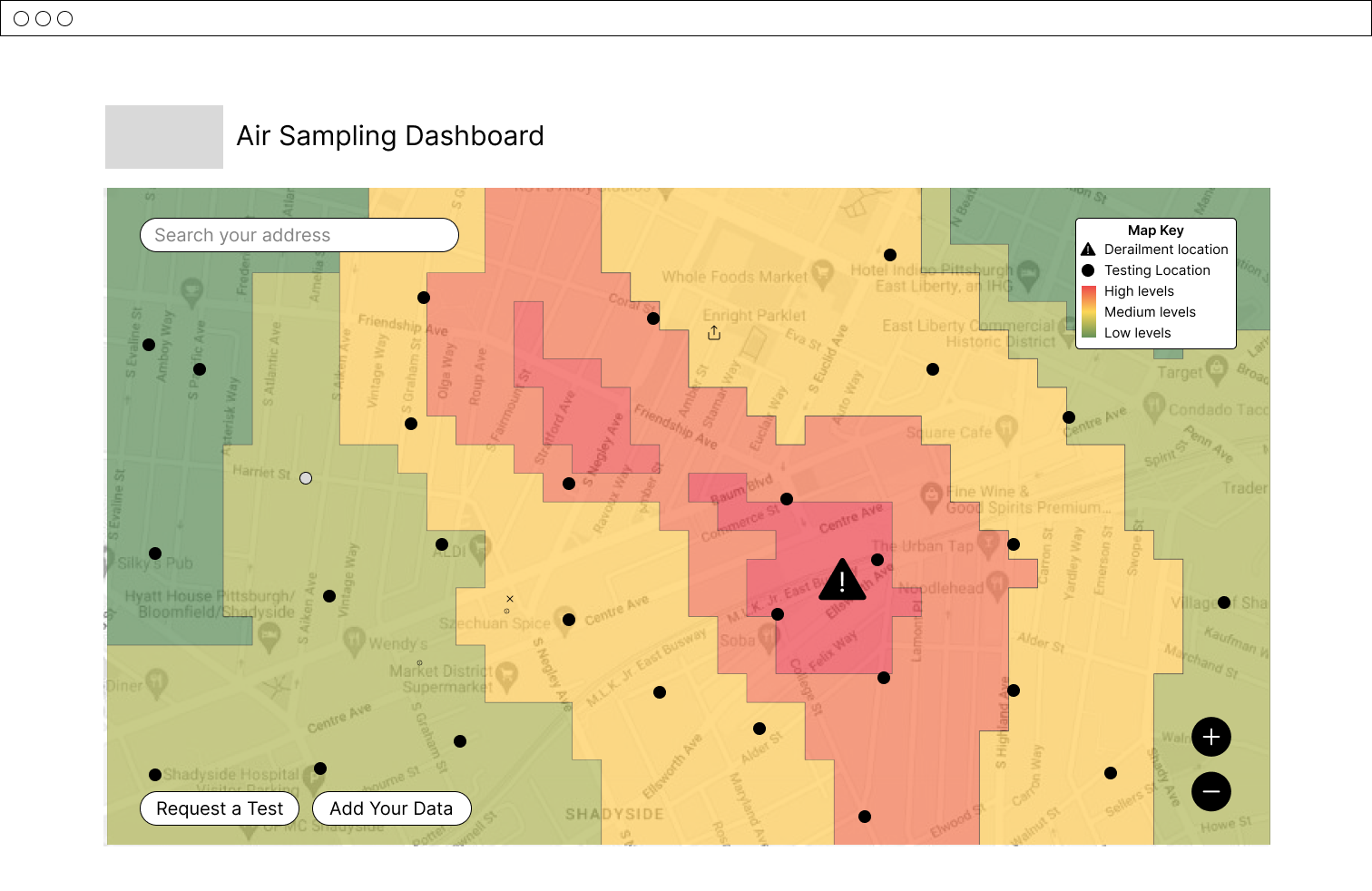
In the second stage of evaluative sessions, I prepared two new dashboards that presented the impact of the test resulted. The first dashboard used a gradient to visualize the impact of the test, while the second used a more defined zoned approach. While more testing is needed to draw any conclusions, some users interestingly expressed a better understand of the gradient dashboard because, while it is less definitative, the gradient emulated the quality of air and left room for uncertainty, which lead them to trust the results more